MARMOT | NEWELL BRANDS
ecommerce
enterprise-wide technology stack migration, UX, accessibility
Role: UX Designer, Research, Information Architecture, Wireframing, Usability Testing, Project Manager
Tools: Salesforce suite, InVision, Zeplin, Axure, Sketch, Smartsheet, JIRA
Duration: 28 weeks, March - October 2020
Team: Digital Experience, Digital Tech, Product Managers, UX, Developers, MarTech, eCommerce Business, Digital Marketing, Brand Marketing, Production, Creative Designers, Asset Management, Order Management, Finance, Third-Party Vendors
Objective: Migrate Marmot onto a new technology stack by analyzing performance data on the current website, determining a feature set, and developing a new site architecture.
Output: A brand new, responsive website from front-end to back-end; new site architecture, new editorial content, new browse, shop, and checkout experiences.
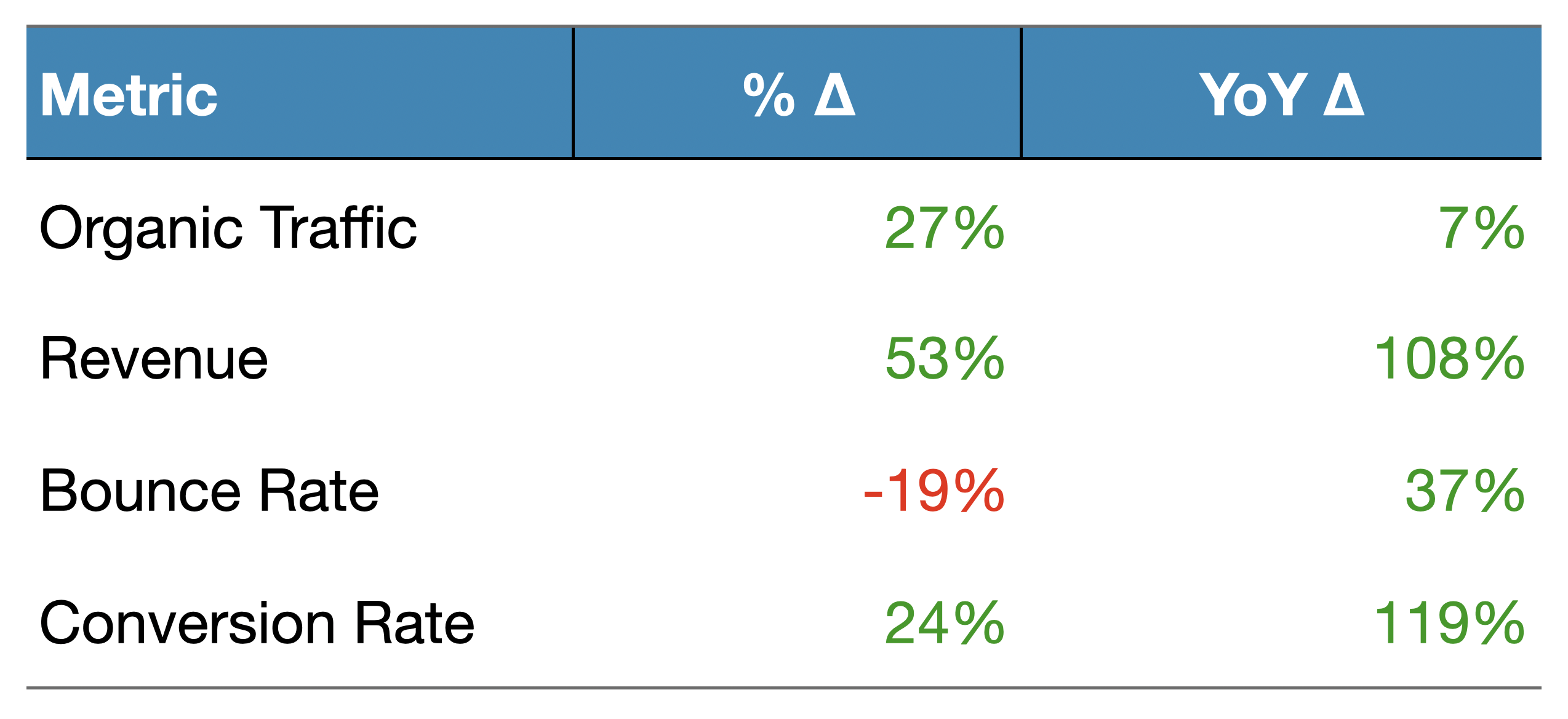
Outcome: 100% of users preferred the new site layout, 25% faster page load times, bounce rate decreased 19%.
Output: A brand new, responsive website from front-end to back-end; new site architecture, new editorial content, new browse, shop, and checkout experiences.
Outcome: 100% of users preferred the new site layout, 25% faster page load times, bounce rate decreased 19%.
Scope of Work
About Project Odyssey
Newell made the decision to migrate our 40+ eCommerce websites on to a new, unified technology stack. This would allow for the consolidation of technologies, financial efficiencies, a user-friendly content management system, and a robust consumer marketing and analytics system. Moving sites over to a new platform meant that we had the opportunity to restructure and redesign the front-end and back-end experience. Project Odyssey is the undertaking of this enterprise-wide restructure of all of our eCommerce systems.
My team spearheaded the whole effort and involved many cross-functional partners from product, developers, digital marketing, creative designers, order management, to finance (and more). I had to gather and understand the business needs for each of the brands and lead the cross-functional teams through the migration process. We worked against a tight timeline (pictured below) and were migrating up to ten brands at once.
Some of the work involved in getting Project Odyssey set up included:
- The tech teams evaluated existing platforms and costs.
- The product team scoped out appropriate architectures and platforms.
- The UX team created a scalable design system and components to be used across all Newell sites.
- The development team built out a CMS that would allow marketing and merchandising teams to make easy updates to the sites.
- The project team built out migration timelines and got stakeholder alignment from the businesses.
- The data management team and digital marketing team worked out how to migrate all of their data and processes.
- Third-party partners assisted in implementing tools and platforms (Salesforce, Afterpay, Narvar, Paypal).
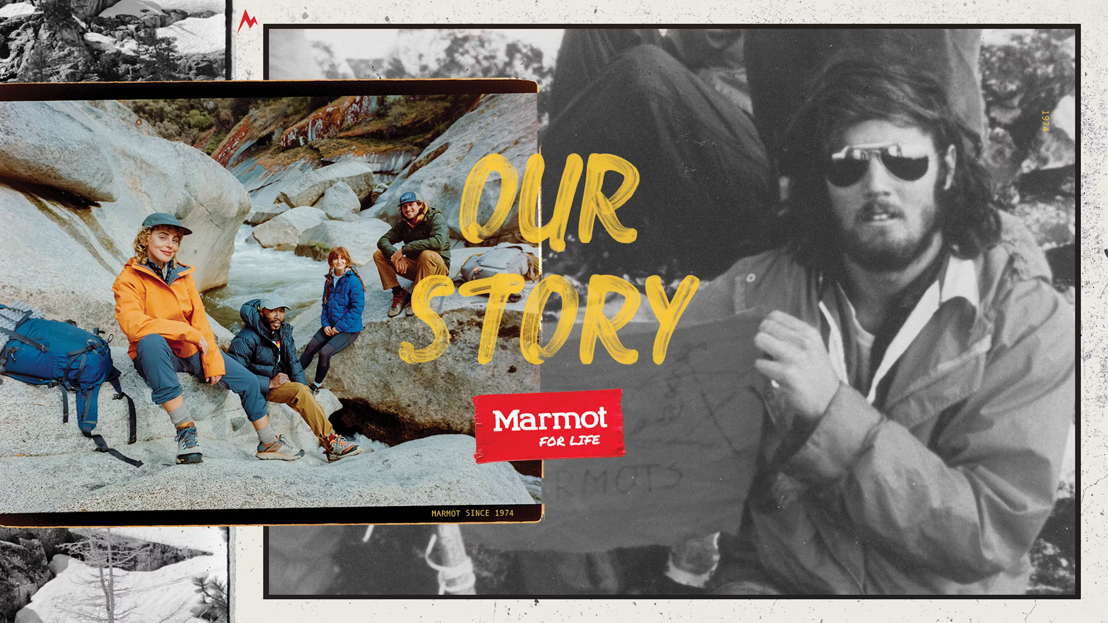
Marmot is a brand of outdoor performance clothing and gear for hiking, camping, and winter sports; selling on a direct-to-consumer website.
The full project plan for Marmot spanned 28 weeks and consisted of six phases - discovery, site planning & design, site configuration & tagging, content building & merchandising, testing & launch, and post-migration activities. Each phase involved many steps and many teams to complete. I was most involved in the process in the following ways:
The full project plan for Marmot spanned 28 weeks and consisted of six phases - discovery, site planning & design, site configuration & tagging, content building & merchandising, testing & launch, and post-migration activities. Each phase involved many steps and many teams to complete. I was most involved in the process in the following ways:


Phase 1: Discovery
Feature Set
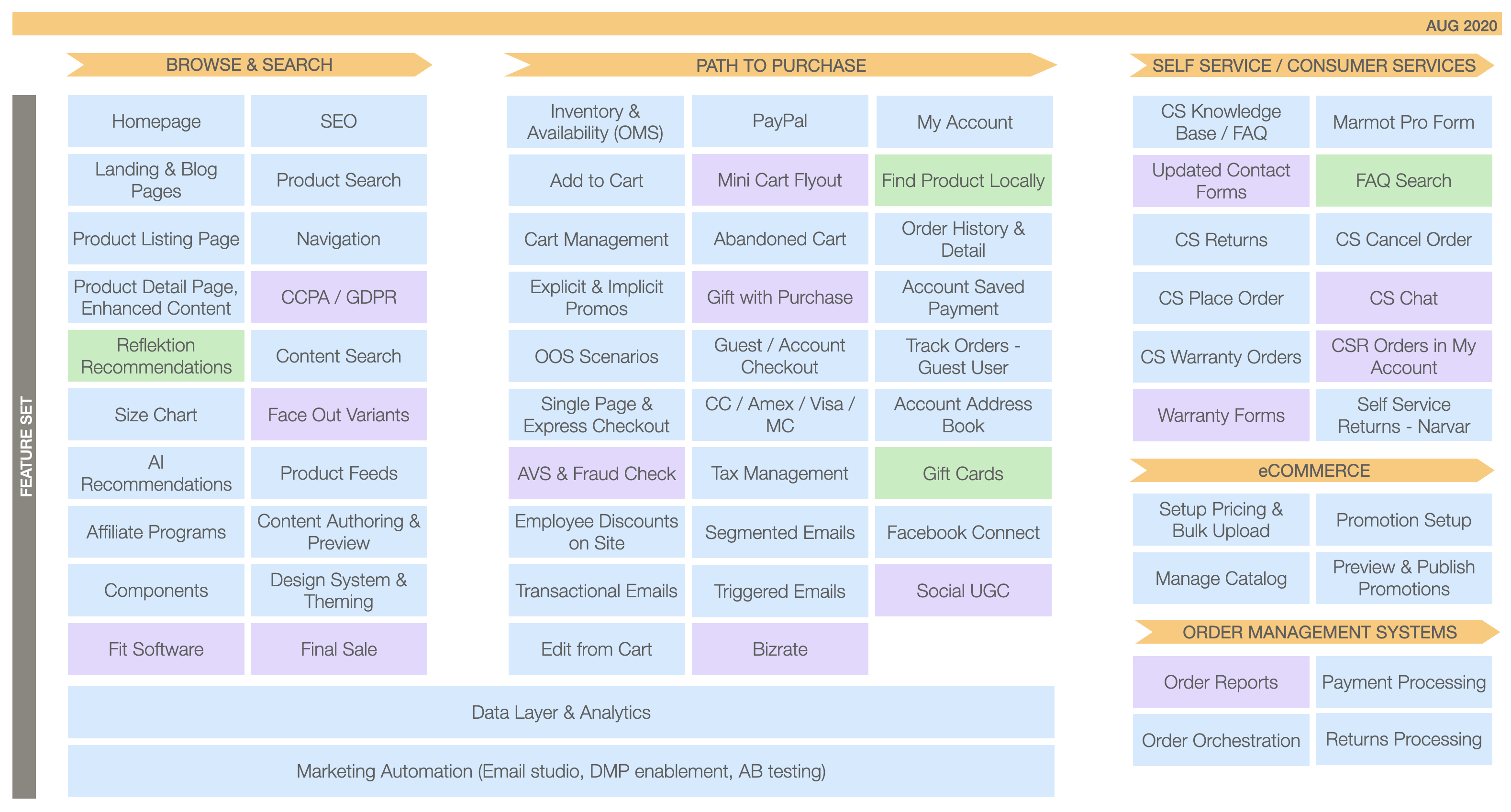
Before starting any migration work, I had to align with business stakeholders on the website’s feature set. Pictured below are the MVP features from browse & search to path-to-purchase to post-purchase. We arrived at this list by identifying the base features needed for a good eCommerce experience, and then we held multiple week-long planning sessions with product, developers, business teams, and consultants to expand upon the features, scope out how to develop it in Salesforce, and build a roadmap for execution.
Site Inventory
I reviewed the current site to understand page inventory, traffic data, SEO health, and navigation. Here, we decided what pages to keep or kill or where we had gaps in the consumer experience. The old Marmot website showed the breadth of Marmot’s assortment and consisted mainly of product pages, but didn’t have content to engage consumers from a storytelling or adventurous lifestyle perspective. Because it was a straightforward shopping experience, it also lacked an educational angle to highlight our various garment technologies. These were the main pain points we wanted to address.
Bring shopping experience up to par with competitors by introducing new PLP, UGC features. Highlight value proposition of Marmot products by educating the consumer.
Engage consumers from a storytelling and adventurous lifestyle perspective.
Navigation / Sitemap
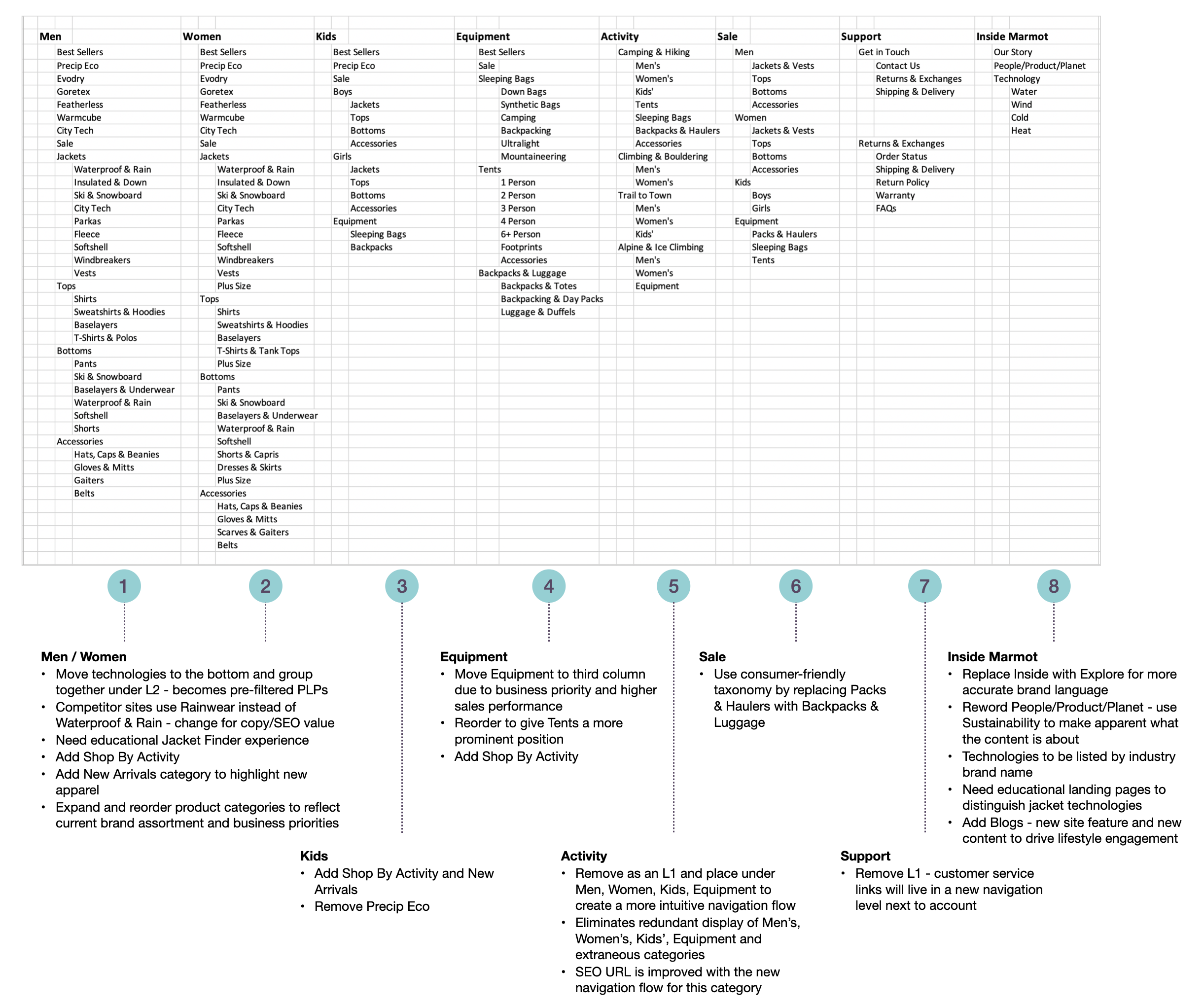
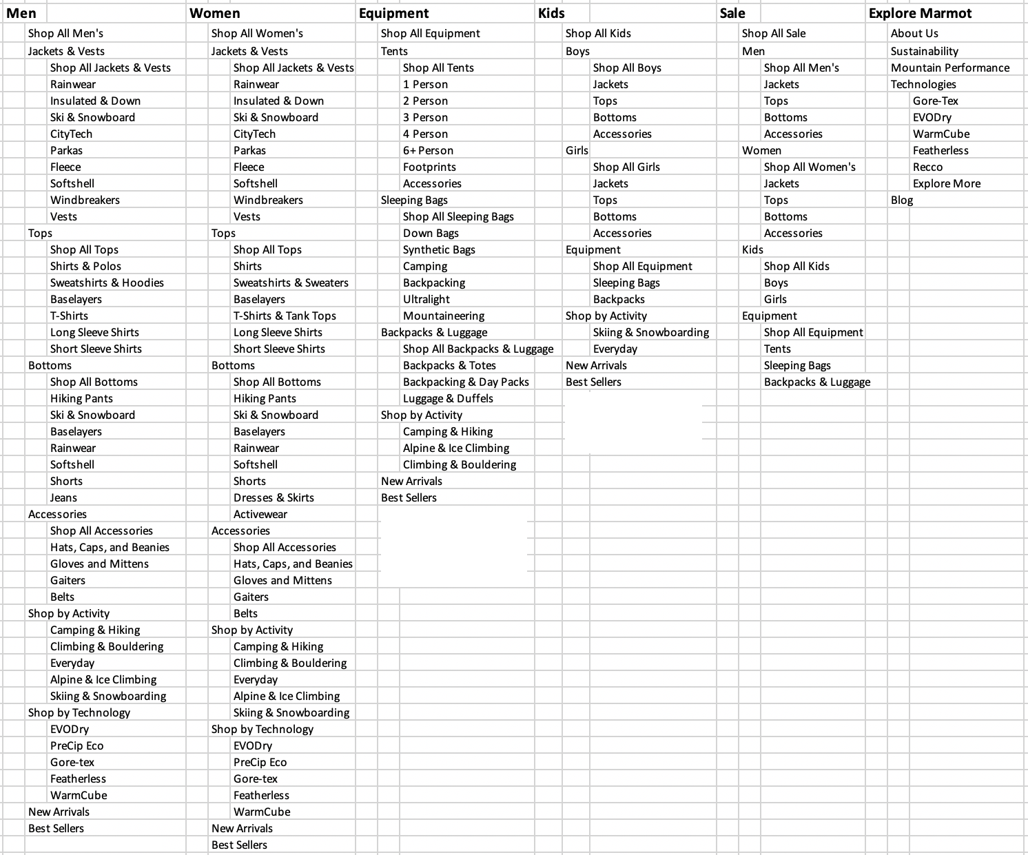
I then restructured the sitemap and taxonomy to improve the user flow and make room for new experiences. With site inventory and traffic data in mind, I chose to expose key pages in the top level of the navigation, expanded some categories, removed duplicative wording, used consistent naming conventions, and shifted them around for a more intuitive flow. I worked with copywriters to choose taxonomy that was more consumer- and SEO-friendly. I future-proofed the sitemap so that if Marmot decides to add new product categories or content, it could easily fit into the established navigational structure without restructuring the whole site and damaging SEO value. The finalized sitemap laid out all the types of pages that would make up the new website and how they would relate to each other. This was the basis for the next phase, wireframing.
Original sitemap with annotations
![]()
Revised sitemap
![]()
Phase 2: Site Planning & Design
Wireframes & Mockups
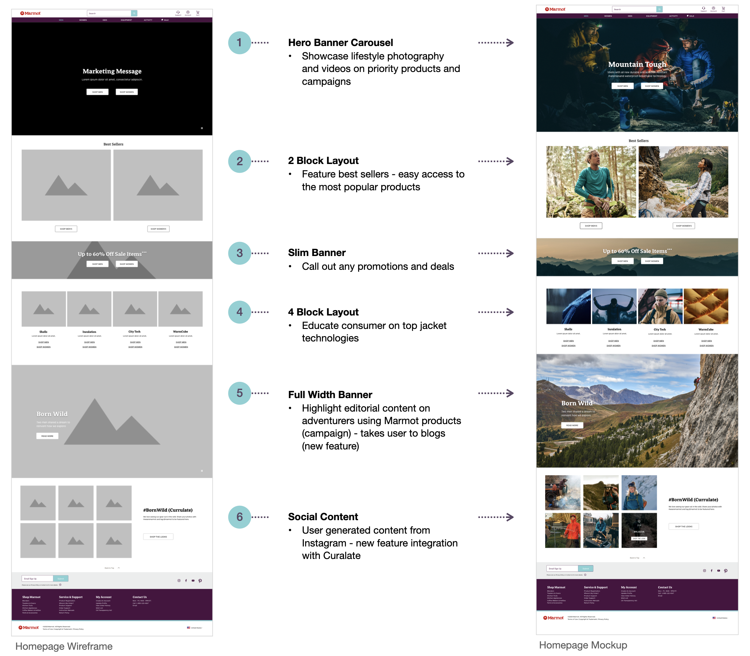
We then needed to align on goals for each page experience. I put together a design brief for the business stakeholders to fill out and this would help inform my design decisions. The UX team had created a design system of roughly ten components to be used as scalable building blocks across all Newell sites. The components were built into the Salesforce platform with defined specifications and functionalities. I had to design landing pages within these constraints. Because this was a migration and we were on a very tight timeline, the primary goal was to move over at least 50% of the existing content to the new platform. With the new page designs, I focused on optimizing the consumer journey and addressing the pain points unearthed during the discovery phase while staying within the CMS framework.
The mockup phase was a collaborative effort with the production and creative team. The teams took my wireframes and filled them out with images, content, and copy, following brand guidelines. I advised on the functionality and specifications of the platform and components. We worked together to optimize the wireframe layouts to suit the content where it was necessary. For example, we ran into issues where the copy they wrote would not fit the character count for the component I chose, or they had to change their color scheme to correspond to CMS constraints. There was a lot of experimentation with the components and layouts to make the site look the best it could be.
I then presented the mocks to the Marmot eCommerce and brand team to get their input and approval on how their brand and products were conveyed. We went through roughly 3 rounds of feedback and revisions. There were 25 landing pages in total. The wireframe and mockup of the homepage is shown below:
New Shopping Journey Experiences
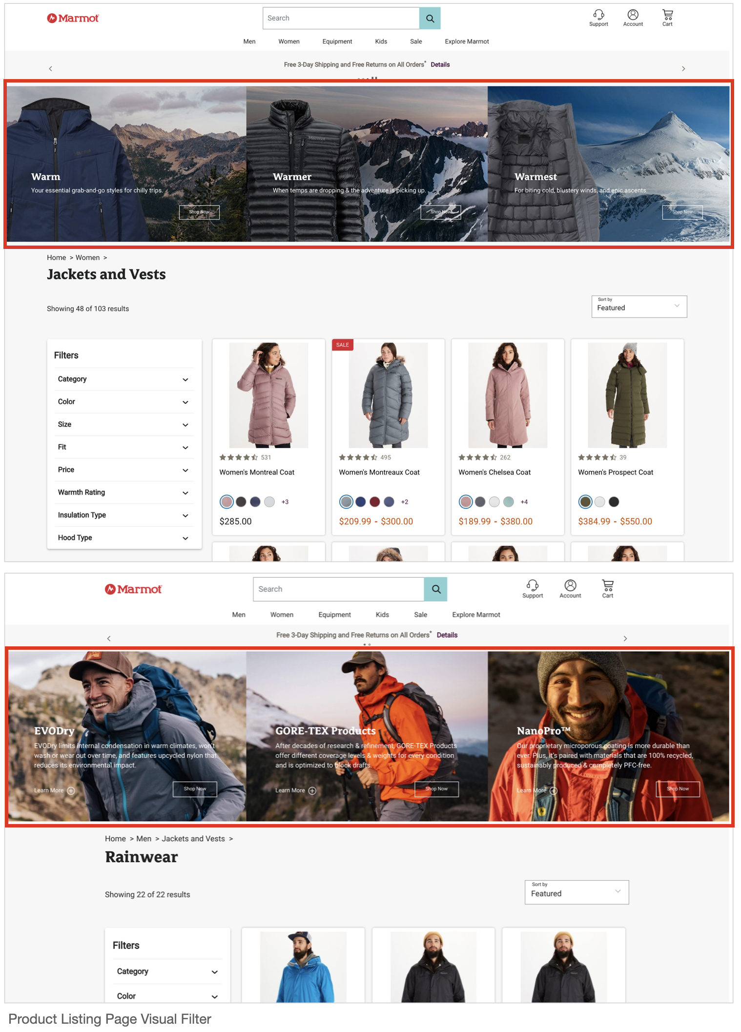
Two new experiences developed for the site included a jacket finder and visual filter. We wanted higher conversion from consumers that might be new to Marmot and do not know where to start with our large product assortment. These experiences helped educate the consumer on the value proposition of Marmot gear and guided them to a purchase destination.
![]()

Designing with ADA & SEO
Americans with Disabilities (ADA) Compliance — We designed the new website to be accessible to people with disabilities. Not only is this a legal requirement to be inclusive of all consumers, but it prioritized functional design over solely visual aesthetic, and this is the core purpose of UX. For visual and auditory clarity and for screen readers to pick up our content, we made sure we had complete alt text, prohibited images that used baked-in text, used high-contrasting colors, built in hierarchy for keyboard accessibility, and removed auto-play videos that featured sound for example.
Search Engine Optimization (SEO) - We designed in a way that search engines can efficiently and accurately crawl the content on our website and index it in their database. This was important to maintain site traffic and search engine results page (SERP) rankings to our website, and to make it easier for our consumers to find our products. We had to make sure we implemented optimized key words, meta data, redirects, URL structures, SEO copy blocks, and structured markup, among many other SEO principles.
Phase 3: Site Build & Configuration
Site Build & Configuration
Once all the creative work was approved, we moved into building the pages within the CMS and merchandising products. I worked with developers to make sure the data, product descriptions, color swatches and variants, attributes, and images were flowing into the system properly. I built out the navigation and added branding elements onto the platform. The producers then built out all of the landing pages in two weeks. I helped with other backend configurations that were also happening at this time — order management systems, consumer service systems, pricing, tagging and analytics, third-party integrations, email configurations, and SEO optimizations.
![]()

Phase 4: QA/UAT/SIT Testing & Site Launch
Launch
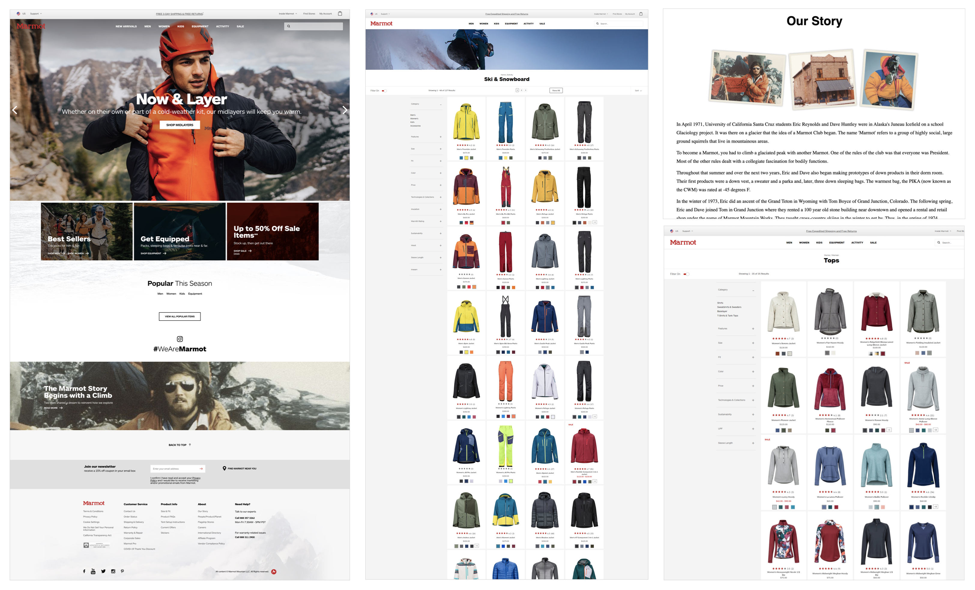
We allowed four weeks for testing and launch-readiness activities. This included QA and SIT testing across all of the pages and links we built out, as well as the analytics tagging configurations. User acceptance testing (UAT) was dependent on approval from the brand team, marketing, analytics, and consumer services. We tracked bugs and change requests, and executed only business-critical updates at this stage. Regression testing was carried out, and Cloudflare (CDN, DNS) was configured for cutover. And then we launched during a 4-hour 2 a.m. launch and audit session in October 2020. A few weeks later, we carried out a post-launch retrospective, and identified optimizations to continue improving the site, as well as the migration process.
Before
![]()
After![]()
Before
After

Post-Migration: Perfomance & Optimization
Post-Migration Performance
One month out from launch, user testing showed:
100% of users preferred the new site layout 87% of users preferred the new site content
67% of users said the new site was a upgrade 44% of users noted visual appeal 25% faster page load times
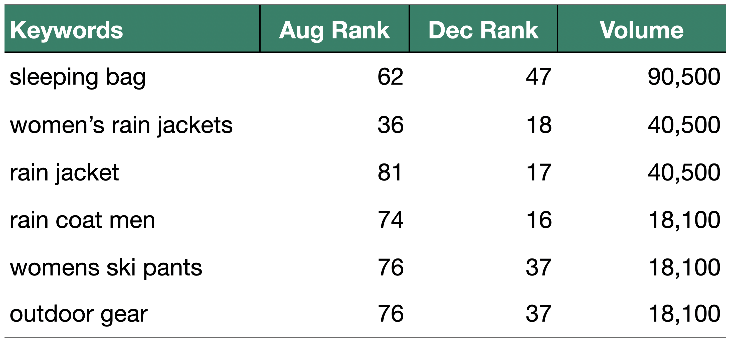
Additional metrics below show improvements across the board, in traffic data and keyword rankings.
![]()
![]()
Additional metrics below show improvements across the board, in traffic data and keyword rankings.
Design Optimizations
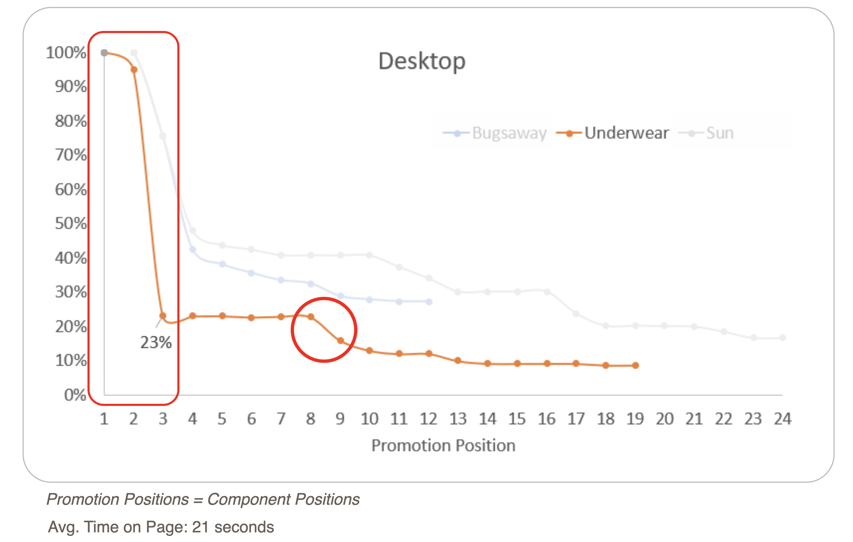
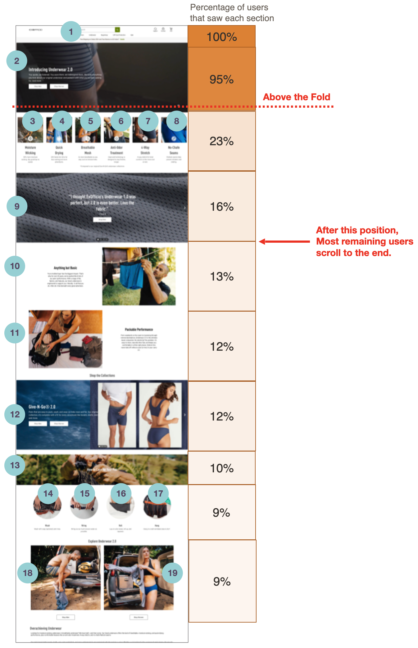
A new analytics system gave us the ability to track metrics for each component as a user scrolls down the page. We are able to see views, CTR, and even minute interaction behaviors. This data allowed us to make pinpoint design optimizations to pages.
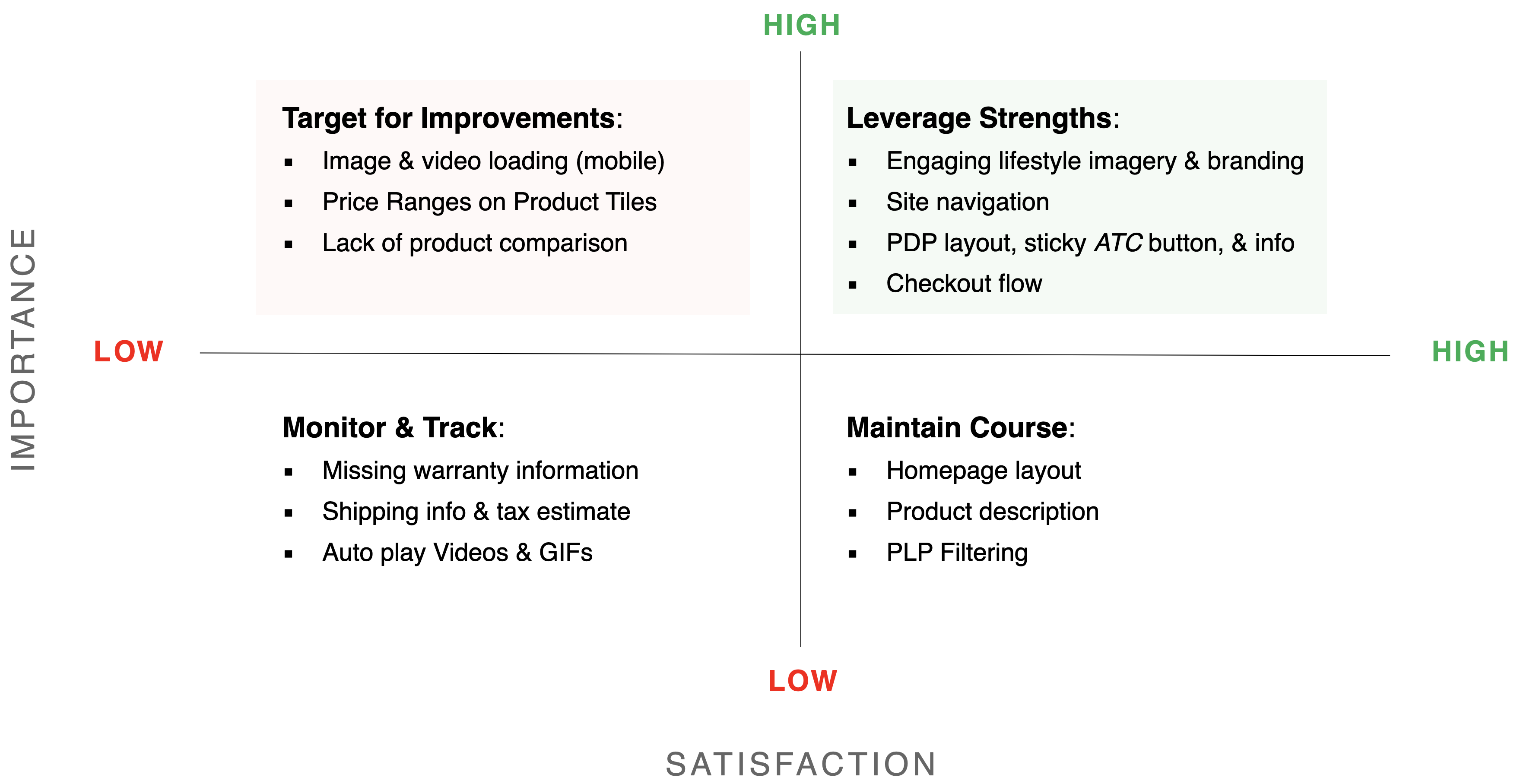
For example, users drop off the homepage after the top component, so we are looking at ways to rearrange the most important information and A/B test different layouts.
![]()
For example, users drop off the homepage after the top component, so we are looking at ways to rearrange the most important information and A/B test different layouts.
Backlog & Next-Phase Features
With user testing feedback and next-phase business requirements, we started compiling and sorting backlog features to continue building upon the site.
![]()
