DISCOGS
vinyl record shopping journey
visual design, UX/UI
I started collecting vinyl records over the Covid pandemic of 2020. What better way to quell your despair at the state of the world than withdrawing into a nostalgic media format for your favorite albums?
The go-to website for vinyl collectors is Discogs, which looks like a 2003 database for searching for books at your little local library. I first encountered this site in 2014 and hated it so much that it drove me away from vinyls. Now in 2020, I found myself using it weekly. It took a bit of time for me to understand the user interface. The current site functions fine as a database, but it feels antiquated (and not because vinyls are).
Before I even arrived at the thought of re-designing Discogs, I was pandemic-induced shopping for vintage clothing. I was inspired by an imagined 1970s car ad, the groovy rainbow on my soap dispenser, and a 1960s graphic print. I’m always deeply in love with late-midcentury aesthetics, but was surrounded and inspired by it more so at this time. I wanted to turn that into something. Vinyl records were at the height of the era. So I decided to put the two things together.
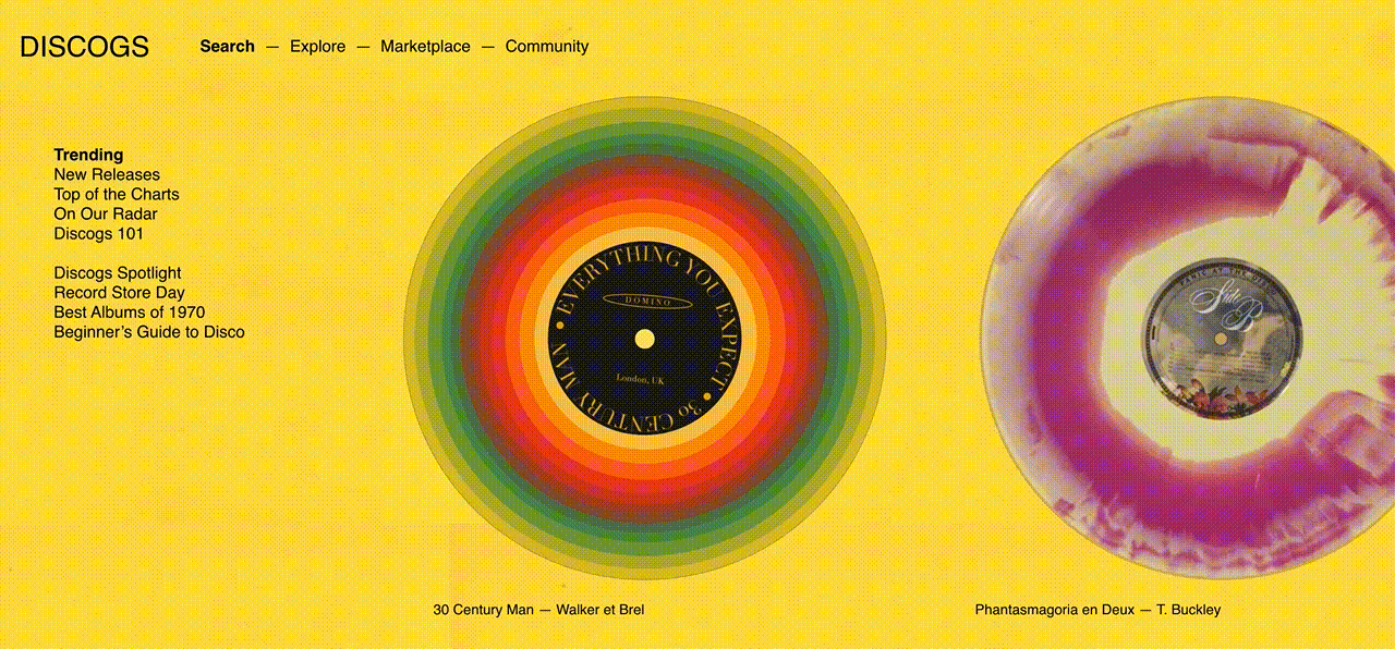
Other projects I’ve worked on involved more serious brands and topics and had rules around them. With this, I wanted to put visual design first and play around with shapes, colors, and alignment. There was a boldness, ingenuity, and minimalism in midcentury design that I wanted to bring to Discogs. I designed the shopping journey to be a more sensuous (groovy), clean, and condensed experience.
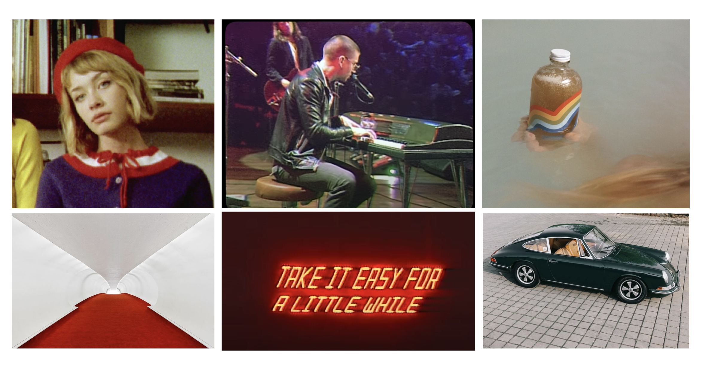
Moodboard
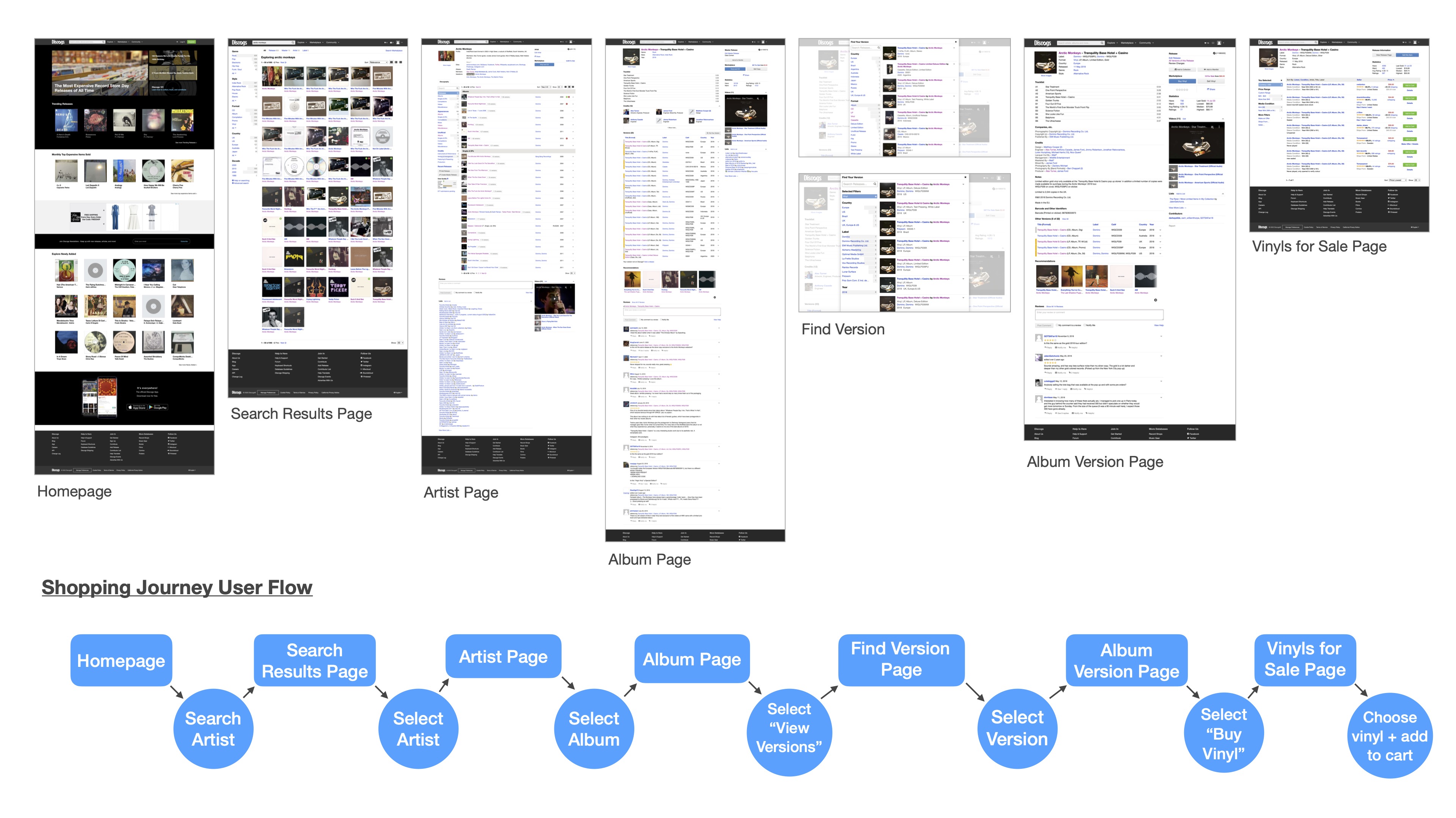
Current User Flow
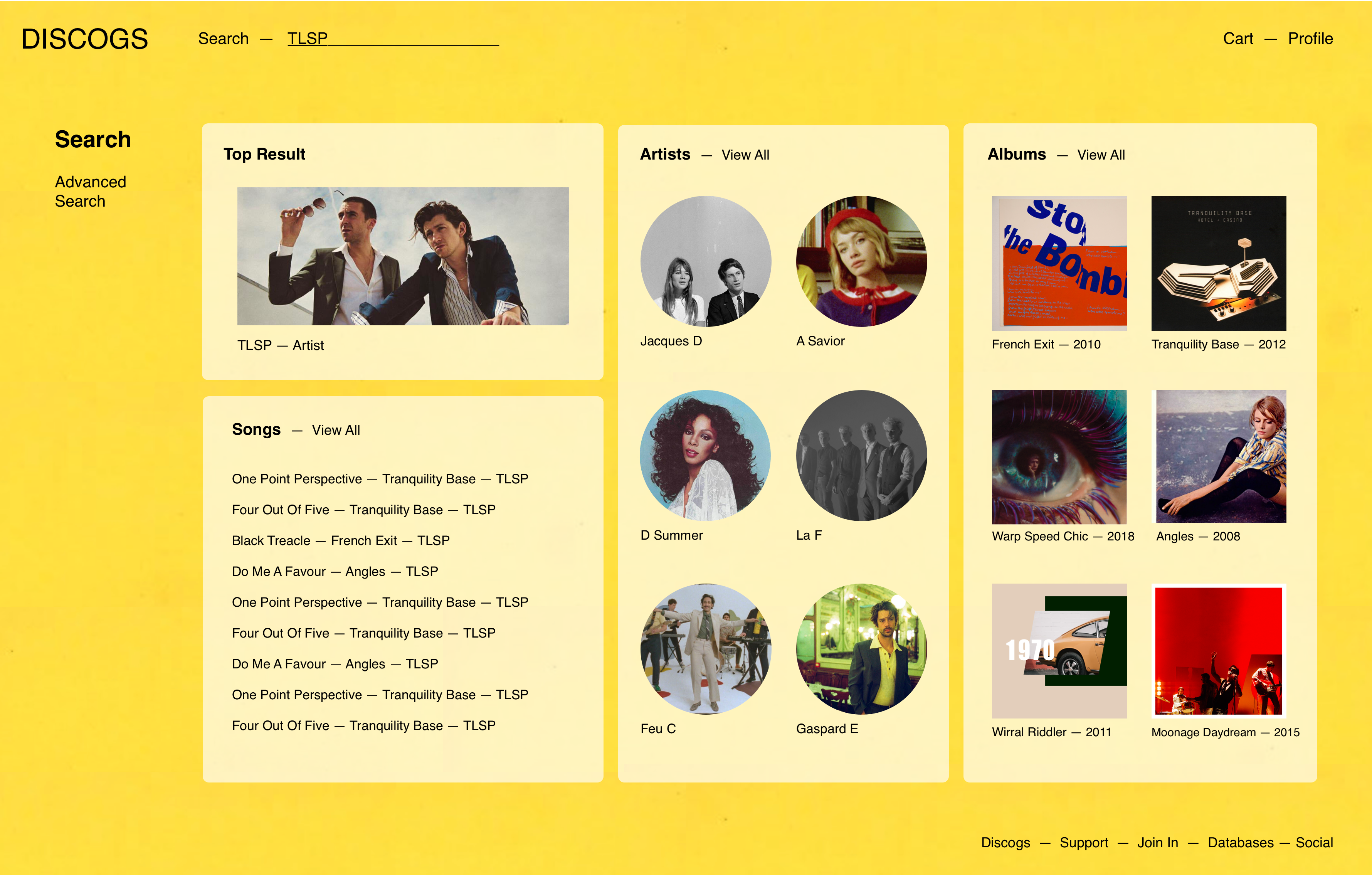
The current Discogs site requires the user to navigate many different pages to arrive at the record they seek to purchase.
There are many ways to get to the same destination and the steps you needed to take are not linearly depicted. They added multiple prompts for first-time users, telling you to click here and there to search for your record.
There are music videos, comments section, edit history, a lot of information that crowds up the pages that can be hidden or moved elsewhere.
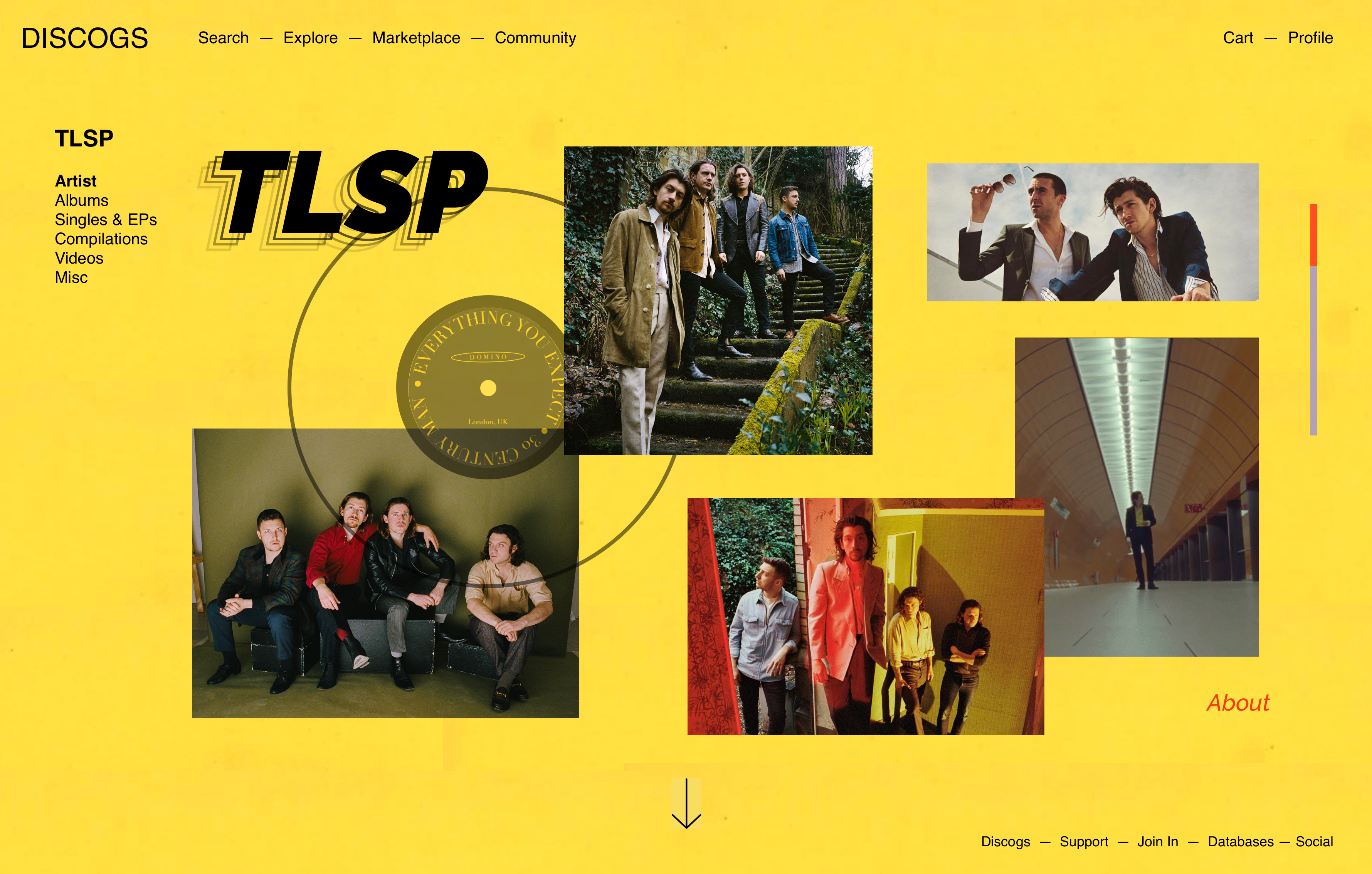
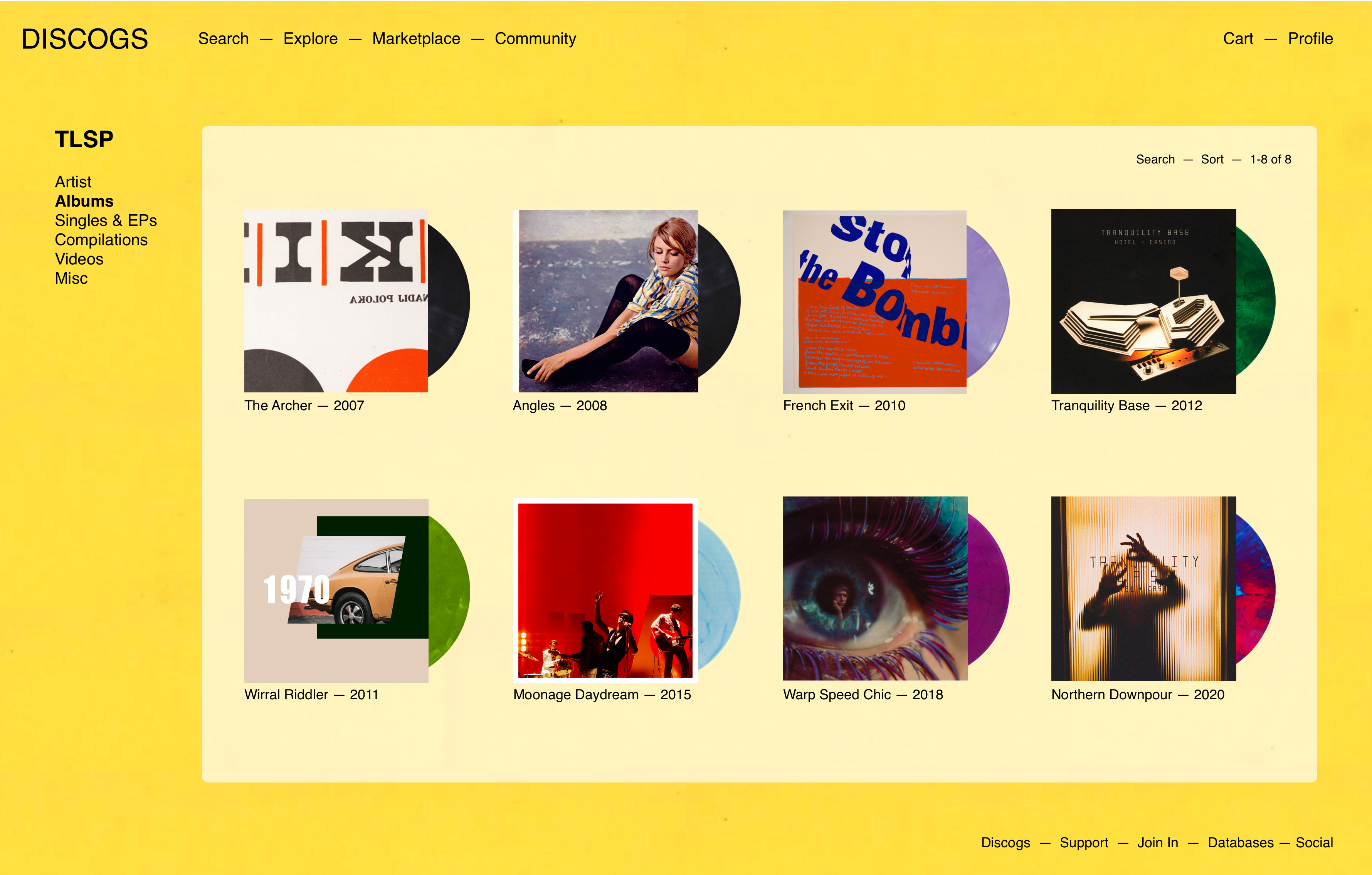
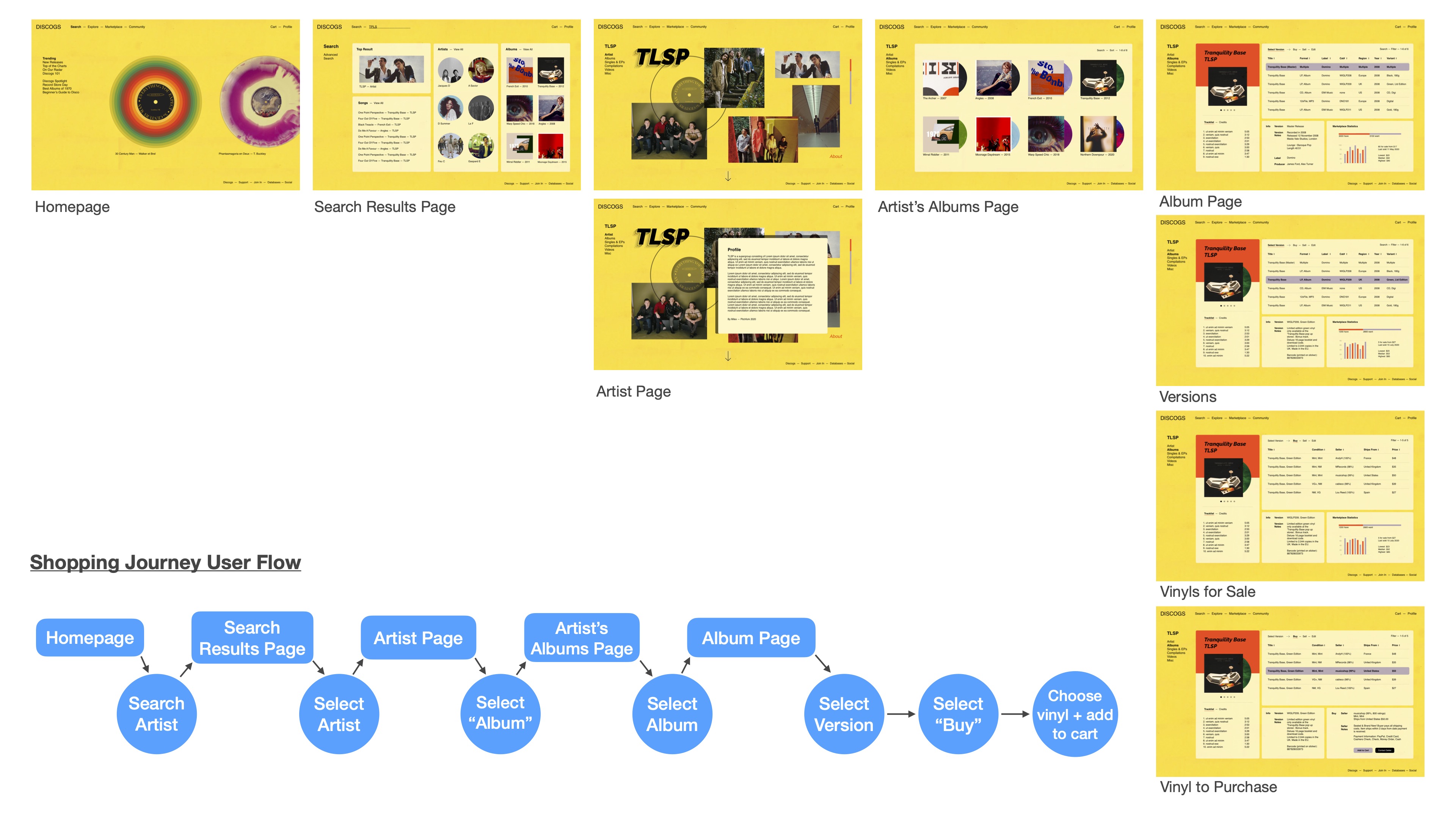
New User Flow
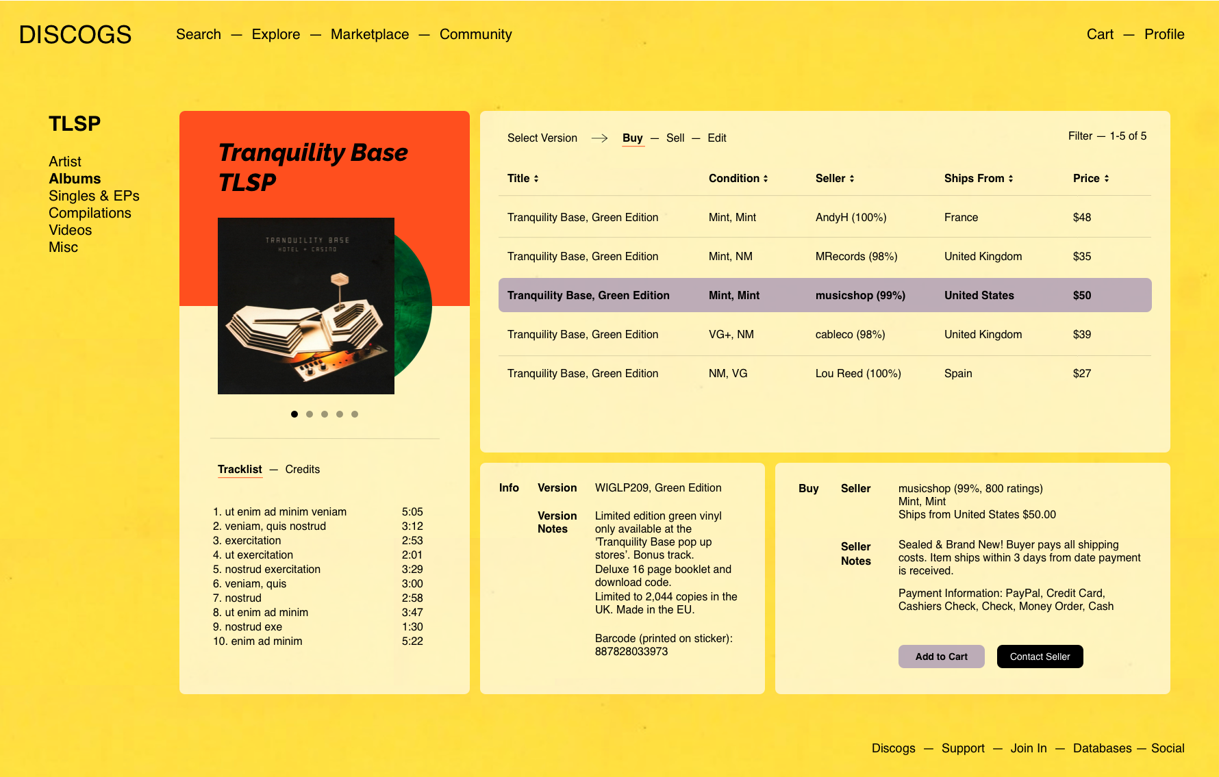
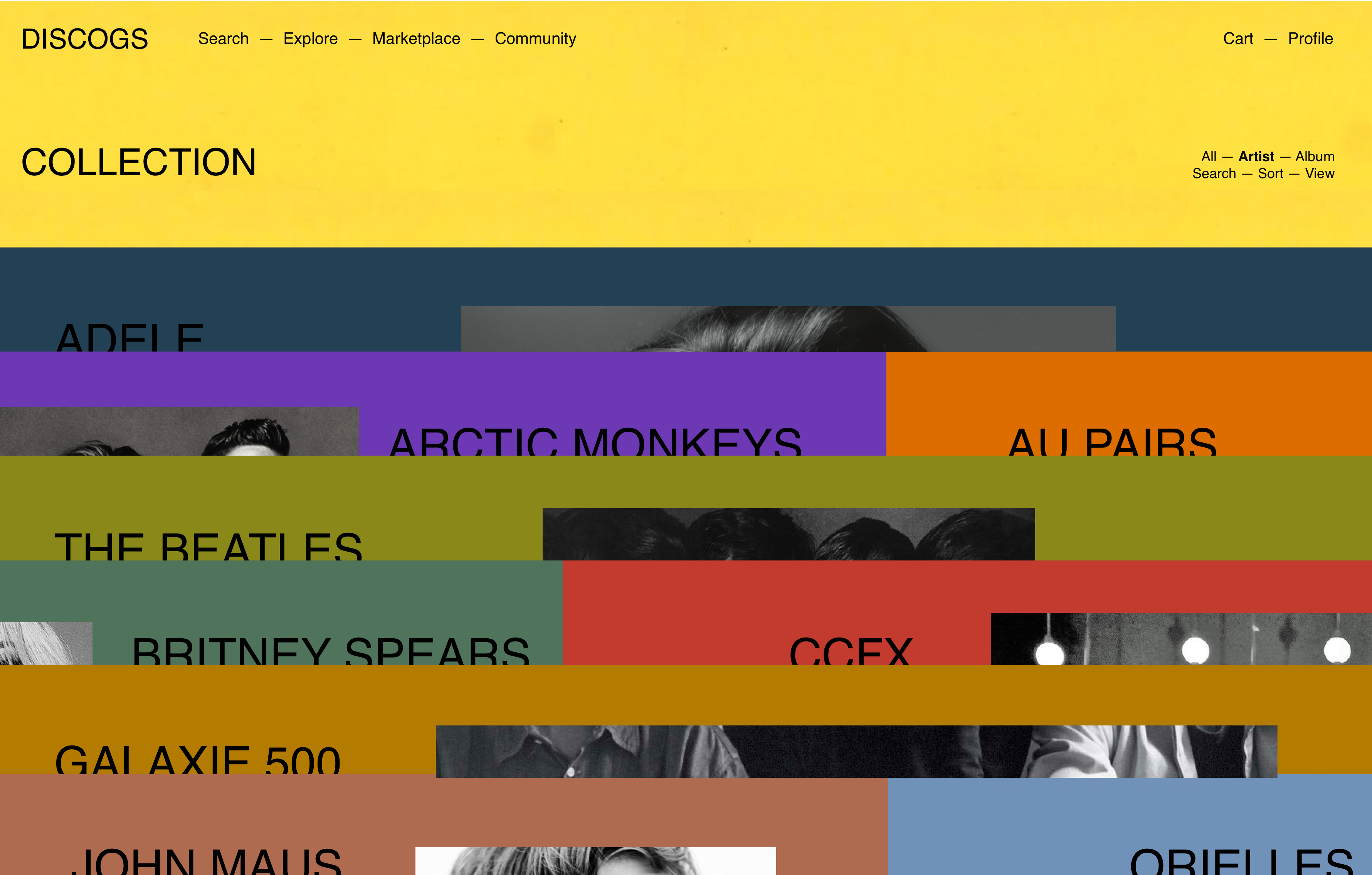
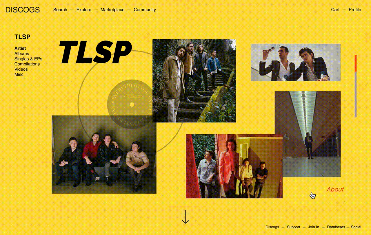
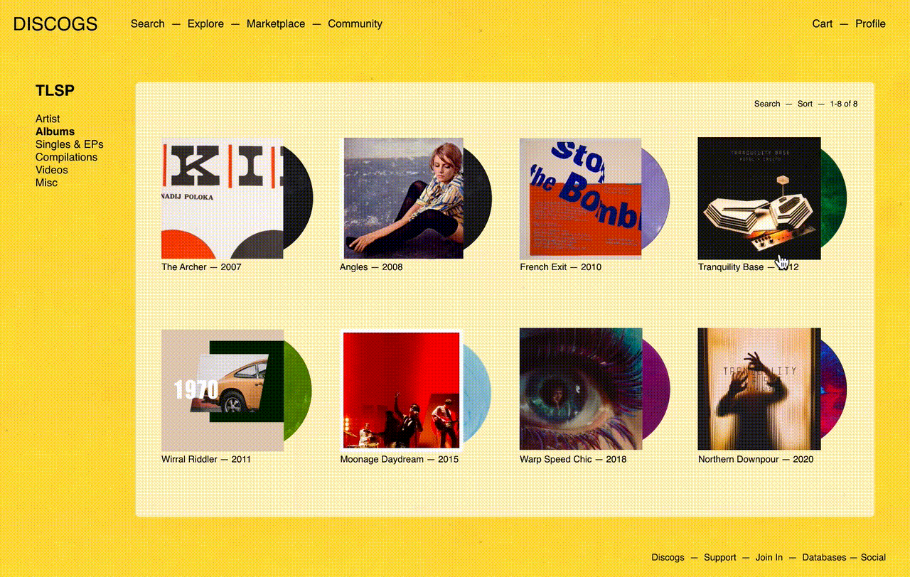
This design cuts down on the number of pages a user will confront, by consolidating the last part of the shopping journey onto a dashboard-style view. As users make their selections, the information in each module will change on the same page. That way users can see all of their options in front of them and navigate back and forth easily.
This design brings the browsing experience more up to par to digital music streaming services, while keeping the emphasis on the artist and the physical media (vinyl record) that the user is on this website for.
Wireframes